
Climate change map shows how much your town has heated up
7 Feb 2014
... login or subscribe for full story
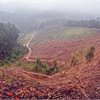
Under Lula, Amazon deforestation falls to lowest level in a decade
Tue 14 Jul 2026
Deforestation in Brazil’s Amazon rainforest has fallen to its lowest level in a decade during the first half of 2026, according to official government figures.

COP31 president says electrification is ‘surest way to protect citizens’
Tue 14 Jul 2026
Last month, COP31 president-designate Murat Kurum launched a target for 35% of the world’s final energy to come from electricity by 2035. In an interview with Carbon Brief, Kurum says that the target was not a political choice, but instead reflects the latest evidence on “what is needed to keep 1.5C within reach”.

Europe recorded 10,000 excess deaths during late-June heatwave, data shows
Tue 14 Jul 2026
European countries reported more than 10,000 excess deaths during the record-breaking heatwave that engulfed the west of the continent in late June, official data showed.

World oil demand set for first annual decline since 2020, IEA says
Tue 14 Jul 2026
Global oil demand is set to decline for the first time since 2020 as the Iran war wreaked havoc with production and exports in the Middle East, the International Energy Agency said Friday.

Trump administration opens endangered species’ habitats to development, reversing 50 years of environmental law
Tue 14 Jul 2026
The Trump administration reversed decades of longstanding environmental law protecting endangered species on Friday, opening up sensitive habitats of those protected species to drilling, mining, farming and real estate development.

Climate change becoming a major driver of child marriage across Asia and the Pacific
Tue 14 Jul 2026
The growing intensity of natural disasters across Asia is leading to increasing numbers of child marriages of girls, according to aid organisations.

EU drafts 'electrification' plan to curb oil and gas use, after Iran war disruption
Mon 13 Jul 2026
The European Union plans to introduce a raft of policies and funding schemes to shift more of its economy to run on electricity, instead of oil and gas, a draft European Commission proposal seen by Reuters showed.

Don’t gut flagship green rules, Sweden tells EU
Mon 13 Jul 2026
Sweden has vowed to block any effort to dilute the EU's proposed decarbonization scheme ahead of a policy showdown next week that is pitting capitals against each other.

Microsoft emissions surge 27% as AI buildout crimps climate goals
Mon 13 Jul 2026
Microsoft's greenhouse gas emissions jumped 27 percent in its latest fiscal year, the tech giant disclosed Thursday, adding to a wave of worsening environmental reports from an industry racing to build AI infrastructure.

Africa secures $900 million in new clean cooking commitments
Mon 13 Jul 2026
African countries have secured $900 million in new financial commitments to expand access to clean cooking technologies, which replace polluting fuels with cleaner alternatives, said the International Energy Agency.